A product display page, also referred to as a PDP, is one of the most important pages on any ecommerce website. This is the page where customers will gather all of the available information about a product before deciding whether they want to purchase or not.
In this blog post, we will talk in more detail about what a product display page is, why they matter, and the key elements of a good product display page.
We will also give you some of the best practises you need to be doing to create great PDPs, give some of our favourite examples and answer some of the web’s most commonly searched PDP questions.
What is a Product Display Page?
A product display page is a page which displays all available information about your product and is the last touch point for a customer before deciding to add a product to their cart or go straight to the checkout.
This page type is where you will give the user multiple product images, a full product description, full pricing options and delivery information. All of this information is needed to the customer can make an informed decision and decide whether or not they are ready to buy.
Here’s an example of a product display page from Lacoste:
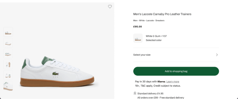
This is what we can see when we first enter the page. We have multiple product images, the full product name and the price. We also have an area for you to select your site and then add it to your shopping bag.
Further down the page, we see:
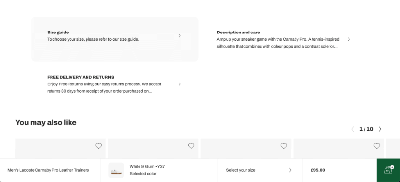
Here we can see a size guide, a clickable button to find a full product description and care instructions as well as information about delivery and returns.
We are also given a “You may also like” section. We will talk about this a little later.
Why do Product Display Pages Matter?
Product display pages matter, often moreso than all other page types on an ecommerce website. Including the product listing page.
This is because product display pages are almost always the last point of contact between a customer and your product. This is the page where, generally, the buying decision is made. Not only this, but product display pages are sometimes even the first point of contact between a customer and your product, especially if you are using them as part of a paid advertising campaign.
Because of this, your product display pages need to make a good first, and last, impression with your potential customers. You need to make sure the page is filled with informative and well-crafted content and the page has a great user experience for customers on all devices.
The Key Elements of a Good Product Display Page
Great product display pages all share the same elements in order to give them the best chance of converting potential customers into buyers.
Great Images
This is, perhaps, the most important feature of a good product display page. Customers want to see what they are buying before they enter their card information, so you need to show your product in the best light.
The first image you show needs to be the best, your headline image, and then you can also add in supporting images to help the customer understand more about what the product will look and feel like.
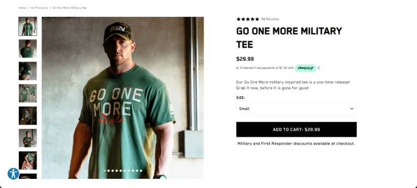
For example, if you are selling a men’s t-shirt, then you could start with the front of the t-shirt, then show another image showing the back of the t-shirt as well as the item being worn by a model, or multiple models showing different body types.
Bare Performance Nutrition, a US-based sports nutrition and apparel company does this incredibly well:
Video
Sometimes, great images of your product are not enough. If this is the case for your business, then you need to ensure you are also showing video on your product display pages.
This can be done in a standalone section of the page, or within the product images. The main goal here is to show the product in a better light for customers, something that cannot be shown in an image or even multiple images.
Some companies choose to show a “product trailer” whilst others will choose to show a video showing how the product works. What the video shows is dependent on what you are selling, but one thing is the same. Most product display pages will need to display a video at some level on the page.
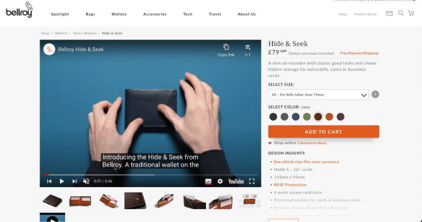
Bellroy do this incredibly well. Some products, such as their “Hide and Seek” men’s wallet, need a little more explanation. So a video is displayed directly within the product display page to help customers understand more about the product, which may help them make a decision on whether to purchase the product or not.
Product Name
One of the most important features of a product display page, your product name.
This is important because it often carries the “brand” for your product. Customers will often visit your product display page and not buy right away, you need to ensure your product name is memorable enough for the customer to type into a search engine and find your website right away.
You also need to ensure your product name is as descriptive as it can be. This is going to help your product bring in more organic traffic. For example, if you are selling white trainers for men, having these keywords somewhere in the product name will help:
- White
- Trainer
- Men
You don’t have to call your product something as simple as a “Men’s White Trainer” but you could add these descriptive words to the end of your product’s brand name, for example.
A Well-Written Product Description
Your product description is another crucial part of your product display pages.
You need to ensure that the information given is both descriptive and well-written. This way, it will give your potential customers all the information they need to know and, potentially, convince them to buy.
This is especially important if you are selling something such as fitness supplements. This type of ecommerce site will fall under Google’s YMYL (Your Money Your Life) requirements, meaning you need to give full information about the ingredients, for example.
Again, Bare Performance Nutrition do this really well.
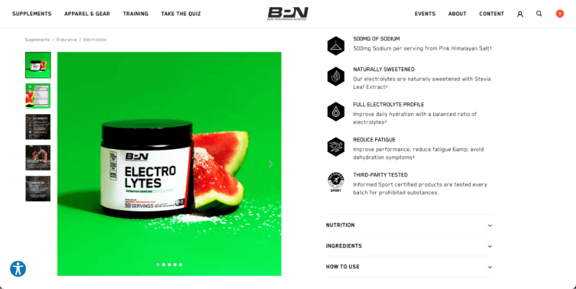
In the first part of their product description, we can see details showing us that per serving we are getting 500mg of sodium from Pink Himalayan Salt, it’s naturally sweetened and we get a full electrolyte profile.
We can also see dropdowns for the nutritional value of the product and the ingredients, as well as a section on how to use the product.
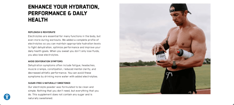
Further down on the product display page, we have some well-crafted information explaining how the product is going to help us. We can see we are going to be able to replenish and rehydrate during training, we will be able to avoid symptoms of dehydration and we get another paragraph emphasising that the product is free from sugar and naturally sweetened.
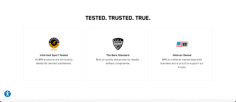
We also have some trust markers at the bottom of the page informing us that the product is third party tested for banned substances, and information telling is that the brand is veteran owned and operated.
Reviews and/or Star Ratings
Star ratings and/or reviews sections are crucial on product display pages.
This is where other customers get a chance to review your products, and potential customers can see these reviews. Nothing is more powerful in convincing customers to purchase your product than other reviews from people who have purchased the product before. No matter the brand power, reviews will almost always be the deciding factor in most cases.
It’s vitally important that you show bad reviews too, as this adds to the trust of a brand. Most companies choose to do this through integrations with review sites like TrustPilot. This way, bad reviews will show up, also. The aim, of course, is to have many more positive reviews than you do negative reviews. But hiding bad reviews is going to leave customers with a bad feeling as it shows that you, as a brand, may have something to hide.

Product Display Page Design Best Practises
Now that we have talked about the things you need to include within your product display pages, we now need to talk about the best practises for designing great PDPs for your business which will give you the best chance at converting.
Showing Good Reviews
We spoke a little earlier about the importance of adding a section for reviews and/or star ratings within your product display pages. Showing great reviews from real customers is vitally important as it adds a layer of social proof to your product that you cannot get anywhere else.
Most companies choose to do this in one of two ways. They will either add specific reviews into their product display pages, or they will integrate a popular review site like TrustPilot or reviews.io, which is easy to do if you are using a website builder like BigCommerce or Shopify.
If you have a product with lots of good reviews, customers will feel better about purchasing your product from your business, ultimately adding more revenue to your business’ bottom line.
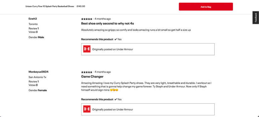
Here is an example of this done really well from Under Armour:
Additional Product Recommendations
Sometimes, the product a customer lands on is not going to be right for them. This is completely natural and happens a lot. The key here is to keep these customers on your website and stop them from bouncing, heading back to the SERPs and potentially purchasing from a competitor.
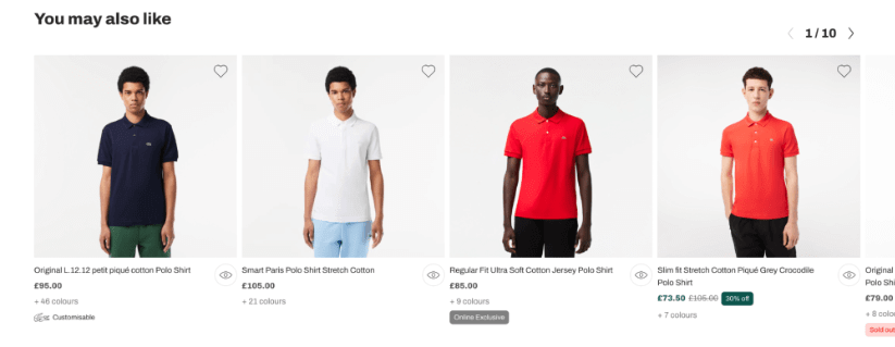
In instances like these, adding a space to recommend other products is vital as the customer may set their sites on another design, colour or item that they may want to take a look at. This has a range of benefits, beyond the conversion aspect, as it will also help your on-site metrics such as time on page, bounce rate and engagement rate which could have an indirect impact on your website’s rankings.
We really love the way Lacoste do this.
Emphasising Product Scarcity
Fear of missing out, or FOMO, is a real thing. When customers see that a product is scarce, running out or completely out of stock, they want it more.
Emphasising product scarcity to your customers, without lying to them, is vital as it will (in most cases) give a boost to your conversion rate.
Companies do this in a number of ways. They will often show how many are left in stock, display low stock messages or even display messages saying that it will be discontinued at a certain date. All of these will give your customers this FOMO feeling and they will be more likely to buy from your business, there and then.
Promotional Offers
Of course, most buying decisions will almost always come down to price. Especially when you are competing with lots of other companies selling similar products.
Think Ralph Lauren vs Lacoste, Stanley cups vs Yeti cups and more. If you are selling similar products at similar price points, discounts and promotional offers are where you will gain a competitive advantage.
Examples of Great Product Display Pages
In order to help you create the best product display pages you can, we’ll now spend a little time showing you some of our favourite product display pages for different brands we admire.
Bellroy
When we think about a great product display page, we think Bellroy. This is applicable whether you are looking at their wallets, phone cases or bags. For this example, let’s look at their PDP for their “Transit Workpack”.
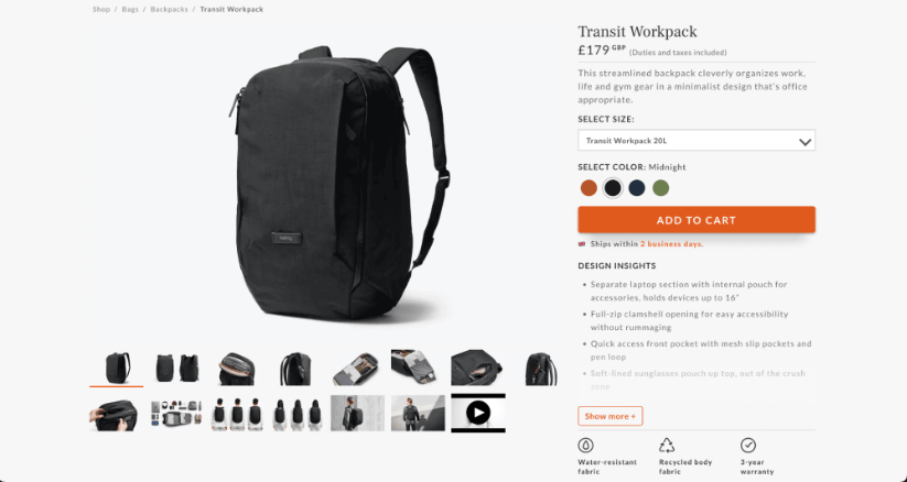
In the first part of the PDP, we see lots of great product images which the user can scroll through to learn more about the product and how it works. We can also see the price labelled very clearly on the screen.
The user also has the ability to set the size of the bag they want and the colour they want before adding it to their cart.
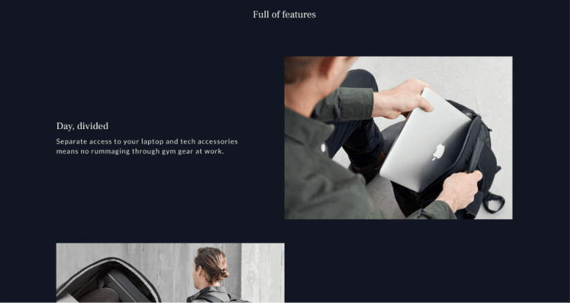
Scrolling further down the page, we can see a small section of text (and photo) for different key features within the product. The image shows how you have a different section within the bag for your laptop and tech accessories.
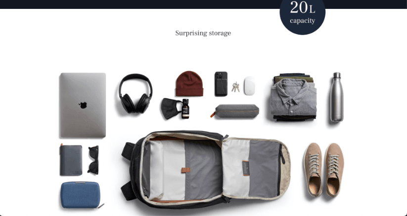
The final section of the PDP shows an image with the bag and all of the things you can fit into the bag, which is great for users as it allows them to really get a feel for what they can fit into the bag, a surefire way to increase conversion!
The Emma Mattress
We love the PDP for the Emma Mattress. It’s unique in it’s design and build, which we will talk about in a little bit. It shows off the mattress in its full form, which is rare and it gives customers a lot of opportunities for conversion.
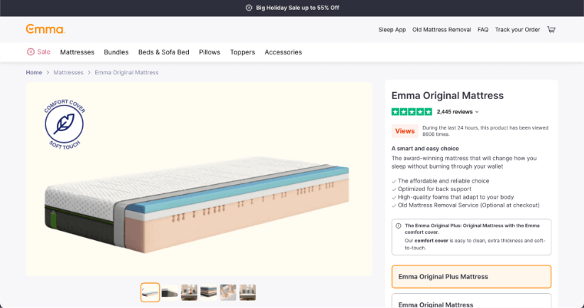
In the first part of the PDP, we notice that the image of the mattress is huge, and designed to bring your attention to the mattress. We can also see a toolbar on the right-hand side of the page which shows the name of the mattress, reviews, a short product description and an option to select the “Plus” mattress or the standard mattress.
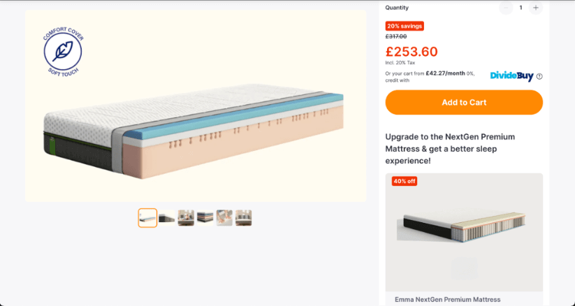
Scrolling further down the page we see that the image does not scroll away from you. This is done by design as the marketers at Emma, naturally, want to keep the mattress at the centre of your attention. Here is the stage where we now see the price of the mattress, with some financing options as well.
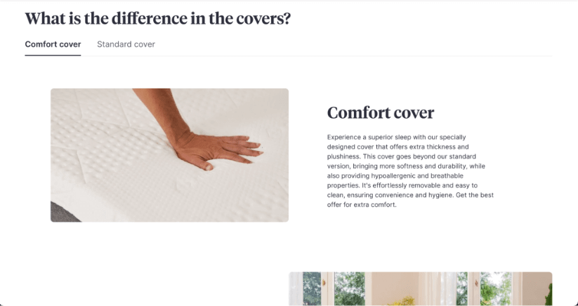
Even further along the page we are given the difference Emma’s standard cover and their comfort cover. This is, of course, an opportunity for them to upsell and add more to their bottom line which is always a good thing for them.
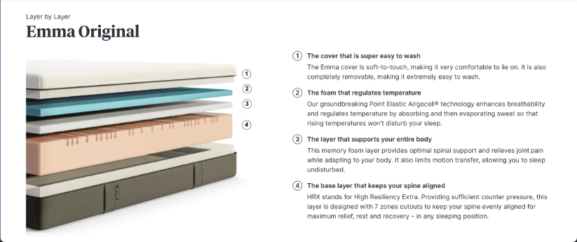
Entering the second 50% of the page, we can see an image showing how the mattress is built. This is, of course, good as it will give customers more detail into the “inner workings” of the mattress and what is going to make it work for them.
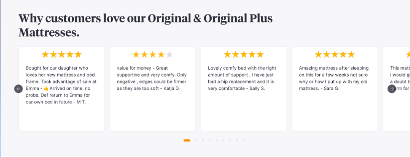
Finally, we come to more reviews. These reviews show the star rating and the introduction to the review which is adding another layer of social proof, enabling more customers to feel confident about buying an Emma mattress.
Product Display Page FAQs
How do you structure a product display page?
Structuring an effective product display page is very simple, but it involves focussing on the key elements of the page. You need to start with a clear product title, a short product description (you can add more detail further down the page) and you need high-quality images and videos.
You should make the price as clear as possible, make any custom options clear and simple for the user to use and include product reviews where you can, especially if they are positive reviews.
You also need to ensure you are including product specifications, shipping details and giving users related products. Finally. Ensure the page is mobile friendly for a seamless experience.
How many photos should be on each product display page?
The number of photos on a product display page depends on the product type and complexity of the product. Generally speaking, the more complex the product the more images you need.
Typically, you should aim for at least 5 images, showcasing the product from different angles. For products with variations such as colour or size, include images representing each option!
What is the difference between a PDP and a PLP page?
Simply put.
A product listing page (PLP) is the initial page where users browse or search for products. Then, the page will display a list of items that match the search query or category. It offers a brief overview of products with key details like names, images and prices.
On the other hand, the product display page (PDP) is a dedicated page presenting comprehensive information about a single product. It includes a detailed description, high-qualiuty images or videos, pricing, reviews, specifications, shipping details and related products. The PDP serves as a vital tool to guide customers into making an informed purchase.
There you have it, information as to what a product display page is and more. We hope all this information given to you today will help you create amazing product display pages for your business, improving conversion and revenue along the way.
If you are looking for a tool that makes more out of your Google Search Console data, and allows you to make more data-informed decisions when improving your product display pages, give SEOTesting a try. We offer a free, 14-day, trial with no credit card required to sign-up.


