A product listing page is a vital page type on all ecommerce websites. In this blog post we will explain what a product listing page (PLP) is, why they matter, the key elements that should be included in all PLPs, and the best practices for creating great PLPs.
We will also give you some examples of great PLPs for you to use as inspiration for your page creation and answer some frequently asked questions too.
What is a Product Listing Page?
A product listing page, also commonly referred to as a PLP, is a page on an ecommerce website that presents a list of products based on a category, filter or search query.
This page type is crucial for ecommerce websites to have as this is the page that takes customers from listing pages to product pages where they may spend money. Many webmasters and marketers use product listing pages to move customers further through the funnel through the use of enticing product names and images.
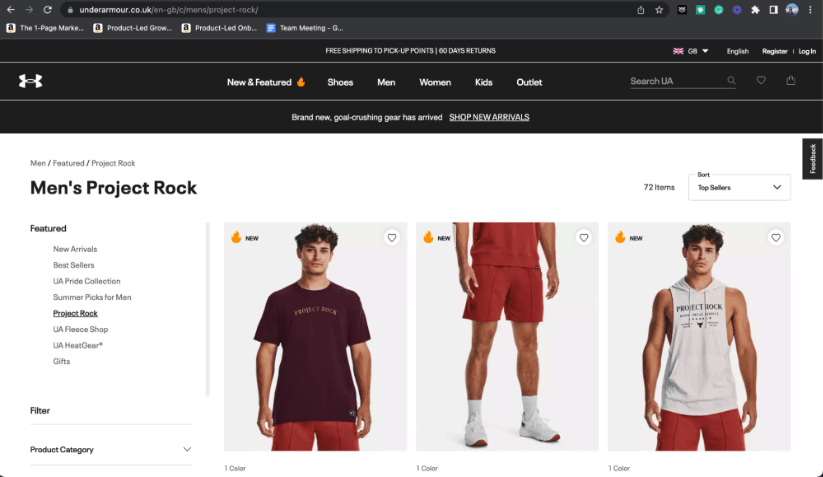
For example, if l take a look on the Under Armour website, and head to their “Project Rock” link, this page presented is a product listing page:
Why do Product Listing Pages Matter?
Product listing pages matter for several reasons.
For starters, they are often the first touch point between customers and your products. You have the chance to make a great first impression with product names, images and descriptions. The aim for all ecommerce websites is to maximise profit and make more sales, having a product listing page that looks great, is easy to navigate and encourages visitors further through the funnel is one of the best ways to do this.
Product listing pages also offer numerous SEO benefits to website owners. Often, product listing pages are the page types that rank for head keywords such as:
- Men’s golf shoes.
- Women’s running shoes.
- Living room rugs.
- Men’s training tops.
You have a great opportunity to get your product listing pages ranking for these types of queries through the use of your meta information, page titles and the text on the page.
On top of all of this, your product listing pages give you a great chance to boost your sales. Visually pleasing pages along with well-crafted copy can encourage users to click into product display pages and, potentially, buy more of your products than they would if you did not have a well-optimised product listing page.
The Key Elements of a Product Listing Page
There are certain key elements that all good product listing pages need. These can be split into different categories.
Product Information
Product images are, perhaps, the most important element of a product listing page. These are going to stand out and grab the attention of users and encourage them, along with the product title and description, to click on a product and make a decision about purchasing.
For any good product listing page, a well-crafted product title is crucial. You need to ensure you are being both descriptive and enticing when drafting this, as this is one of the first things people are going to see when they land on your PLP and scroll down the page.
Whilst full product descriptions won’t be shown on a product listing page, it is still advisable, and important, to show a short product description if your page design allows for it. This will add more context to your products for users and may encourage them to click on products.
Ensuring you have clear pricing (and promotions/discounts if applicable) shown near each product is crucial for a good product listing page. Price, naturally, is one of the biggest deciding factors when it comes to buying a product or not for customers, so ensuring you have clear pricing information on your product listing pages is critical.
General Information
If there is room within your page design, adding in customer reviews, or at least a star rating, to your products featured on your product listing pages will help give extra incentive to your potential customers and convince them to click on your products and potentially buy. If customers can see that other people have purchased and like the product, they are more likely to take an interest.
Shipping information on product listing pages is now non-negotiable. Especially since Amazon and their launch of Prime next-day delivery. Customers will want to know as soon as possible when they can expect their order to be shipped and delivered if they purchase. This can be done in a number of ways on product listing pages, including a sentence saying “order today, receive on Monday” for example. Or “free shipping in 1-2 days” will work too.
Similar to having shipping information shown on your product listing pages, you must ensure you have the current availability shown on your products as well. Customers will not want to order a product that is out of stock unless they are specifically pre-ordering a product. This also needs to be made clear. Generally, you will want all of your in-stock products showing first.
Non-Negotiables
Of course, you need a CTA to click on the product page on all products on your product listing page. Most companies choose to do this with a simple “buy now” or “shop now” button. This tells the user exactly what they can expect when they click it. They know that clicking on a button of this nature will take them straight through to the product display page to learn more, and perhaps buy, the product.
Sometimes, the products that users are looking at on your product listing page might not be right for them. This doesn’t mean the sale is lost. This is an opportunity for you to place some well-crafted cross-sell opportunities on your PLP. Showing similar products, such as different colour or size variations will work well here.
Ensuring you are showing trust signals on your product listing pages is going to prove crucial when you are looking to maximise conversion rate. You can use different trust signals on product listing pages including social proof, like star ratings as we saw earlier, payment trust signals like the “Verified by Visa” badge work well on ecommerce sites. You can also show press trust signals like “featured in Forbes” which will work well, depending on the products you are selling.
Ensuring your page is mobile responsive is also crucial when creating product listing pages. As of July 2023, people using mobile devices add up to 56.96% of all website traffic. Ensuring your page works well on all device sizes, especially mobile is crucial to maximising conversion rate and revenue.
Best Practises when Creating Product Listing Pages
We’ve just talked about the key elements you need on your product listing pages, but there are some best practices you need to know to make your PLPs the best they can be.
We have talked about the fact that product images are amongst the most important features needed on product listing pages.
You need to ensure the images are high-quality and show enough of the product to entice users into clicking through to your product display pages. Most product listing pages, unless using a carousel, only show one image. Because of this, you need to make sure the image shown here is the best it can be.
Some websites will choose to show images of just the product, whilst others will choose to show the product as a lifestyle image. For example, if you are selling shoes then you may choose to show just the shoes as your featured product image. Whilst if you are selling sofas or other furniture, you may choose to show this in an “example” room to give users more of a feel of how it will look in place.
Product titles need to be both descriptive and captivating. Writing “white men’s golf shoes” is not enough to entice a user to click on a product display page, in most cases. You need to make sure you are being descriptive enough so both users and search engines know what it is you are selling, but also compelling enough to entice users into clicking. You can ensure your product titles work well with your images and descriptions to give them the best chance of convincing customers to click through to your product.
Product descriptions are crucial for both users and search engines like Google and Bing. You need to ensure your product description is descriptive enough to accurately convey what your product is, whilst being compelling enough to convince users to click through to the product. This is even more essential given that you cannot, generally, write a full product description on a product listing page and are limited to a short, 1-2 sentence description. Some websites, depending on their design, may not even have any product descriptions listed on the product listing page.
The pricing shown on your product listing pages needs to be clear and concise. Customers need and expect to know exactly what they are going to pay, and if any discounts are available. If discounts are available, they need to know what the discount is and what the final price is once the discount has been applied. Some companies may do this with a strikethrough whilst others will show the final price and mention that is the price with the discount.
When customers are browsing your product listing pages, ensuring distractions are limited is crucial. Try and configure your pages so the products are the main focus of a user’s gaze and nothing more. The aim here is to place as much attention on your products as possible, so there is more chance of them clicking through and, potentially, purchasing and adding to your bottom line.
As mentioned earlier, customers want to know exactly when they are going to receive their products when they order. You can show shipping times directly within your product listing page. Most companies do this by saying “ships in 1-2 days” or similar. However, you can contribute to the customer’s FOMO (Fear Of Missing Out) by putting a message saying “Order within 3 hours for free next day shipping” or similar if you have the capabilities to do this.
Fast loading speeds for all websites are crucial, but they are even more important on ecommerce product listing pages. HubSpot found, in 2022, that for every second of increased page load time, conversion rates drop by an average of 4.42%. This, in an ecommerce setting, is going to cost you a lot of revenue if you cannot sort it quickly and get your pages loading correctly.
The Best Product Listing Page Examples
Here are some of our favourite examples of product listing pages that do a good job of showing some (or all) of the best practices.
Spoke London – Clear & Simplistic
Spoke London does a fantastic job of showing how clear and simple product listing pages can maximise conversions.
The image shown for each product shows a model wearing the trousers so you can get a good feel for how it is going to look. The colours for each trouser are shown clearly and the price is incredibly clear.
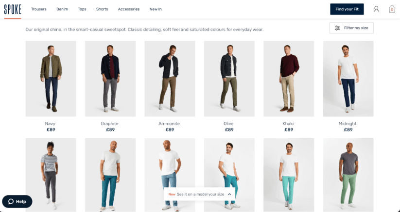
If you look at the bottom of the screenshot above, you can also see a pop-up that allows the user to see the trouser on a model of their size. This is going to improve conversions even more. If someone can select this and see it on a model who more closely resembles their body shape and size is going to benefit them greatly.
Under Armour – Great Filtering & Multiple Product Views
Under Armour creates fantastic product listing pages. As you scroll over each product in their clothing pages, you can see the reverse view which gives you a full look at the product without clicking onto the PDP.
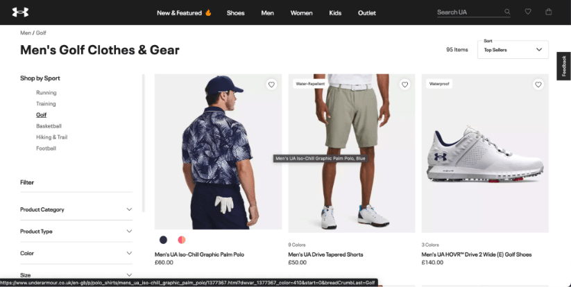
The pricing on the site is also incredibly clear. You can see exactly how much the item is going to cost, minus any discount that you get which is shown on the PDP.
It’s also worth noting the great filtering options on the left-hand side of the screen. We are currently on the golf section, but we can easily filter through to their running gear, training gear or basketball gear, etc. We can also filter down product categories, type, colour and size.
Goldsmiths – Clear Pricing, Filtering and Additional CTAs
Here we take a look at the Goldsmiths website, known for selling high-quality and high-value watches, and other jewellery, online.
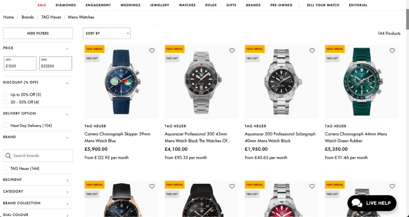
Given price is one of the main drivers of conversion here, the price is shown very clearly. There is also a separate price for customers who are looking to purchase on finance, showing the cost per month.
They also have other conversion aids listed on the site, showing products that are new arrivals and products that include a free gift.
We also need to mention the filter on the left-hand side of the screen. You can filter by price, discount, watches that are available for next-day delivery and more.
This is, perhaps, one of my favourite product listing pages of all time.
NOBULL – Clean & Simple with Great Product Imagery
I must admit, I am a huge fan of NOBULL. I train CrossFit, and NOBULL is a CrossFit brand. But I also love them because I am a marketer, and I love clean product listing pages.
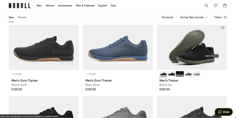
There are certain great things to note here.
The first is the amazing product imagery. We can clearly see what the shoes look like, and when we scroll onto a product we are greeted with another product image which shows the shoes from another angle, and the underside of the trainer. Underneath this new product image we can also see the other colourways the show comes in.
We can also see clear pricing. For the example above, we immediately see that all the trainers are listed at £120.
I also love the live chat feature on the bottom right-hand side of the screen, and the filtering and sorting options available to the user.
Amazon, Naturally
We cannot write an article on product listing pages and not mention Amazon. In my opinion, they have some of the greatest product listing pages of all time. This is expected, given the brand power and wealth of Amazon. But this is still good information to know.
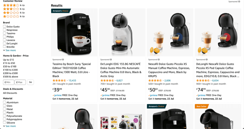
For the example above, I’ve searched for “coffee pod machine” and been given the following product listing page.
We see clear images of the products listed, we have a great filter section on the left-hand side of the page allowing us to see star ratings, brands, price and material.
It’s also worth noting the additional conversion aids on the products themselves. We have individual star ratings for all of the products, also showing the number of reviews! We also have wording showing these can be delivered to me tomorrow. All of this is going to help me convert.
Frequently Asked PLP Questions
We have scoured the web for some of the most frequently asked questions you have been asking about product listing pages and will answer the top questions for you now.
What type of product images should I use on a product listing page?
This really depends on what you are selling, but there are some conventions you should be using no matter what you sell.
You need to ensure that the product imagery is clear, high-quality and shows the product in as much detail as possible. If you are selling clothing, for example, you can either choose to show the product on a model or with a block-colour background. Both can work well, but the image needs to be clear.
You can also make use of scroll features, as we saw in some of the examples above. When the user scrolls onto a product, you have the chance to show them another angle to give more detail about the product, which may also lead to more conversions. Or, at the very least, more clicks into the PDP.
How can I improve the conversion rate of my product listing pages?
If you are looking to enhance the conversion rate of your product listing pages, there are certain things you can do. You first need to focus on your “big three” and ensure your product names, descriptions and images are as good as they can be. Customers need to have a good idea of what they’re purchasing before they click into your PDP.
You also need to ensure your product listing pages have an easy user experience. Sorting and filtering options need to be clear and easy to use. Consider adding an “add to cart” button to make the purchase process easier as there are some customers who will be able to learn enough about your products from the PLP that they do not need to click into the PDP before purchasing.
How do I handle out of stock products on product listing pages?
I like to use a “three step” process to handle out of stock products on product listing pages.
First, you need to ensure customers are aware that the product is out of stock. You can do this by adding a note onto the product, or replacing the price you’d usually show with a message that this product is out of stock. If possible, you should also ensure you let customers know when you expect the product to be back in stock.
You next need to ensure there is a method for customers to stay informed about the product, when it is expected to be back in stock, and when it does come back into stock. Most companies do this with an email, which works well in most cases.
Lastly, you need to regularly update your stock levels via the back-end of your website to ensure your stock is showing as accurately as possible. You do not want products that are out of stock showing as in stock. Likewise, you do not want products that are in stock showing as out of stock!
What are trust signals on product listing pages?
Trust signals, essentially, are badges or other pieces of information that you can add to a product listing page to show users and potential customers that you are a trustworthy website and you are worth buying from.
This could be in the form of customer reviews, press badges from products that have been featured in websites like Forbes, Men’s Health, Good Housekeeping etc etc.
Or it could also be payment verification badges from the likes of PayPal and Visa which will add a level of trust to customers who will need to enter their card details.
How can I use A/B testing to improve product listing pages?
A/B testing is, perhaps, one of the most effective ways to improve the performance of your product listing pages.
Generally, an ecommerce website will have enough product listing pages on the site to create a control group and a test group, whilst ensuring each page has enough traffic and engagement to create a statistically significant test.
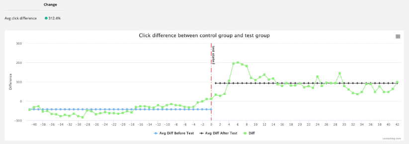
Once you have created your control and test groups, make the change to your test variant pages and wait for the test to gather enough data. Whilst two weeks is the minimum test length, we’d ideally recommend leaving a test running for 6-8 weeks to ensure you collect enough data to make some great conclusions.
In terms of things you can test, you can test almost anything on your product listing pages from the layout of the entire page to pricing locations. You can also test your SEO by changing the layout of meta titles, descriptions and page titles or the impact of big links from other websites.
You can then use the data you have gathered, and whether the test resulted in a positive or negative result, to decide on whether you want to make these changes to the rest of your product listing pages.
There you have it, information as to what a product listing page is and more. We hope all this information given to you today will help you create amazing product listing pages
If you are looking for a tool to help you test your product listing pages for better organic search performance, consider giving SEOTesting a try. We offer a 14-day free trial with no credit card required to use. Sign-up today.


